
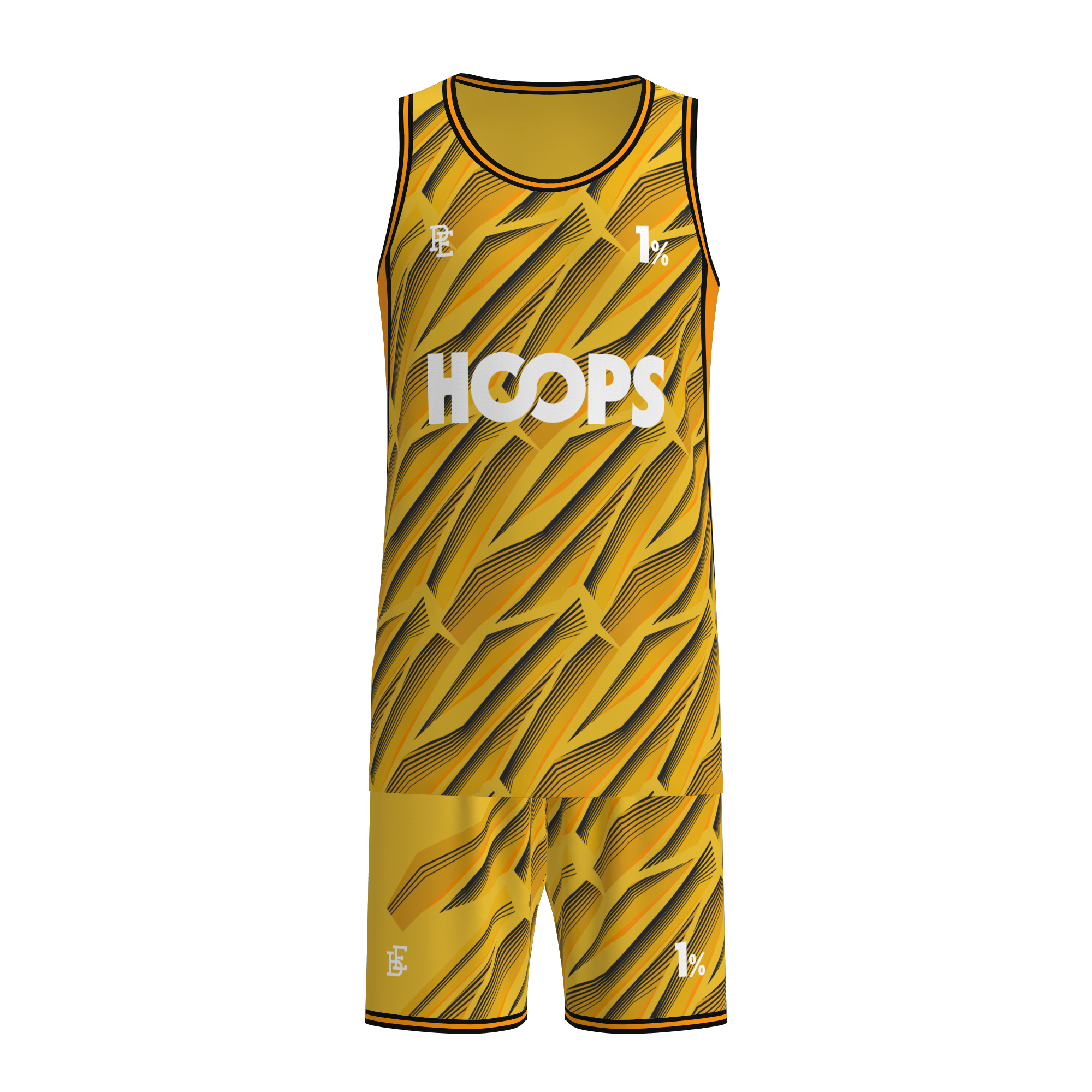
Every club faces the same tension: you need sponsors to fund the program, but the kit also has to feel like yours. Get the balance wrong, and the jersey looks like a walking billboard. Get it right, and players feel proud wearing it while sponsors actually get noticed. Custom soccer jerseys are designed for exactly this balancing act.
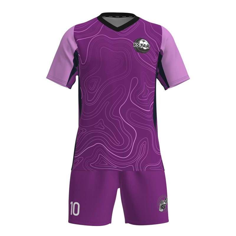
Below, we break down how to lay out a kit that reinforces team identity first, sponsor visibility second—and why this order actually makes sponsors happier, too.
1. Set the Visual Hierarchy: Team First, Sponsor Second
When someone sees your team from 20 yards away, what do they notice first? It should be the club crest and team colors—not the sponsor logo. That's the starting principle. The chest area is prime real estate, but it usually belongs to the crest. The main sponsor sits either below the crest, centered on the chest, or offset to one side—large enough to read, but not so big that it swallows the badge.
This isn't just aesthetics. Fans identify teams by color and crest before they read any text. If the sponsor dominates the chest, the kit stops feeling like "your team's" and starts feeling like "your sponsor's." Players notice this, supporters notice this, and over time it erodes the emotional connection that makes people buy and wear the jersey.
2. Use Color to Keep Sponsor Logos From Fighting the Design
Sponsors usually come with their own brand colors—and they don't always match your team palette. The wrong approach: drop the sponsor logo on as-is, in its full brand colors, and let it clash with the jersey. The right approach: work with the sponsor's branding team to adjust.
Common solutions:
• Render the sponsor logo in white or team accent colors instead of their full brand palette
• Place it on a colored panel or background strip that bridges the sponsor color and the jersey color
• Use sublimation printing to fade the logo into the jersey's pattern, so it reads as part of the design rather than a sticker on top
Sublimation is especially useful here. Because the dye goes into the fabric rather than sitting on top, you can blend sponsor graphics with the jersey's overall pattern—stripes, gradients, camo—so the sponsor feels integrated, not pasted on.
3. Map Sponsor Positions by Tier
Most kits don't have just one sponsor. They have a main shirt sponsor, sleeve sponsors, back-of-neck partners, and sometimes short or training kit sponsors. The key is to size and position each according to its tier—so everyone gets visibility without the kit looking cluttered.
A typical layout:
• Front chest (main sponsor): largest, most visible, centered below or beside the crest
• Sleeve (secondary sponsor): smaller, on the sleeve where it's visible but not overwhelming
• Back neck (partner): small, subtle detail that adds value without competing
• Shorts or sock (minor partner): additional placements for lower-tier sponsors
The mistake clubs make is giving every sponsor the same size and prominence. When that happens, the jersey looks like a patchwork of logos. Tiered placement—main sponsor big, everyone else proportionally smaller—keeps the design clean while still delivering value to each partner.
4. Don't Overcrowd the Kit—Less Is Actually More for Sponsors
It's counterintuitive, but cramming more sponsor logos onto the kit doesn't deliver more value—it dilutes it. When a jersey has five different logos across chest, sleeves, back, and shorts, none of them stand out. Viewers tune out. The main sponsor's message gets lost in visual noise.
Clubs that are disciplined about sponsor placement—keeping the kit clean, with one dominant logo and a couple of smaller partners—actually command higher rates for the main sponsor spot. Why? Because that logo is the one people actually notice. A clean, well-designed jersey with one prominent sponsor is worth more than a cluttered one with five.
5. Build Heritage Into the Design—Fans Buy What Feels Like "Theirs"
Team identity isn't just about the crest. It's about visual language: stripe patterns, color combinations, collar style, sleeve cuffs. Clubs that have consistent design elements—year after year—build recognition faster. Fans see the kit from a distance and know exactly which team it is.
When sponsors are integrated into this existing visual language—rather than imposed on top of it—the jersey feels authentic. Players wear it with more pride. Supporters buy it to wear outside of match days. And sponsors benefit because the kit gets worn more often, in more places, with more visibility.
For youth academies and lower-league clubs, this is even more important. You don't have a decades-old heritage to fall back on—you're building it now. Consistent kit design across seasons, with clear sponsor integration, is how you start building that identity.
6. Fabric and Print Quality Protect Both Brands
A sponsor logo that fades, cracks, or peels after a few washes doesn't just look bad—it makes the sponsor look bad, and by extension, the club too. This is why print quality matters for both team identity and sponsor value.
Sublimation printing on quality performance fabric keeps logos sharp and colors consistent for the life of the jersey. Screen printing can work for simpler designs, but it tends to wear faster. Embroidery adds a premium feel for crests and sleeve marks, but it's not practical for large sponsor graphics.
Working with a manufacturer that handles both fabric selection and in-house printing means the final kit looks cohesive—crest, sponsor logo, player names, all on the same material, all with the same visual quality. No patchwork of different print vendors.
FAQ
How do you fit multiple sponsors without the jersey looking cluttered?
Size and position each sponsor according to its tier. Main sponsor on chest, largest. Sleeve and back-of-neck partners smaller. Avoid stacking multiple logos in the same area. A clean, balanced layout—even with 3–4 sponsors—looks professional. Overcrowding happens when every sponsor gets the same size, which is the mistake to avoid.
Should the kit design change every season?
Not if you want to build strong identity. Consistent design elements—core colors, crest placement, general style—should stay recognizable year to year. You can refresh details (new patterns, slight color shifts) while keeping the overall identity familiar. Too much change erodes fan recognition and makes it harder for sponsors to build visibility over time.
Does fabric quality affect sponsor visibility?
Yes. Cheap fabric with low-quality printing fades quickly, and a faded sponsor logo reflects poorly on the sponsor. Good performance fabric with proper sublimation keeps logos sharp and colors vibrant across the season. The jersey looks better, lasts longer, and sponsors get more value from every kit that's actually worn.
Table of Contents
- 1. Set the Visual Hierarchy: Team First, Sponsor Second
- 2. Use Color to Keep Sponsor Logos From Fighting the Design
- 3. Map Sponsor Positions by Tier
- 4. Don't Overcrowd the Kit—Less Is Actually More for Sponsors
- 5. Build Heritage Into the Design—Fans Buy What Feels Like "Theirs"
- 6. Fabric and Print Quality Protect Both Brands
- FAQ